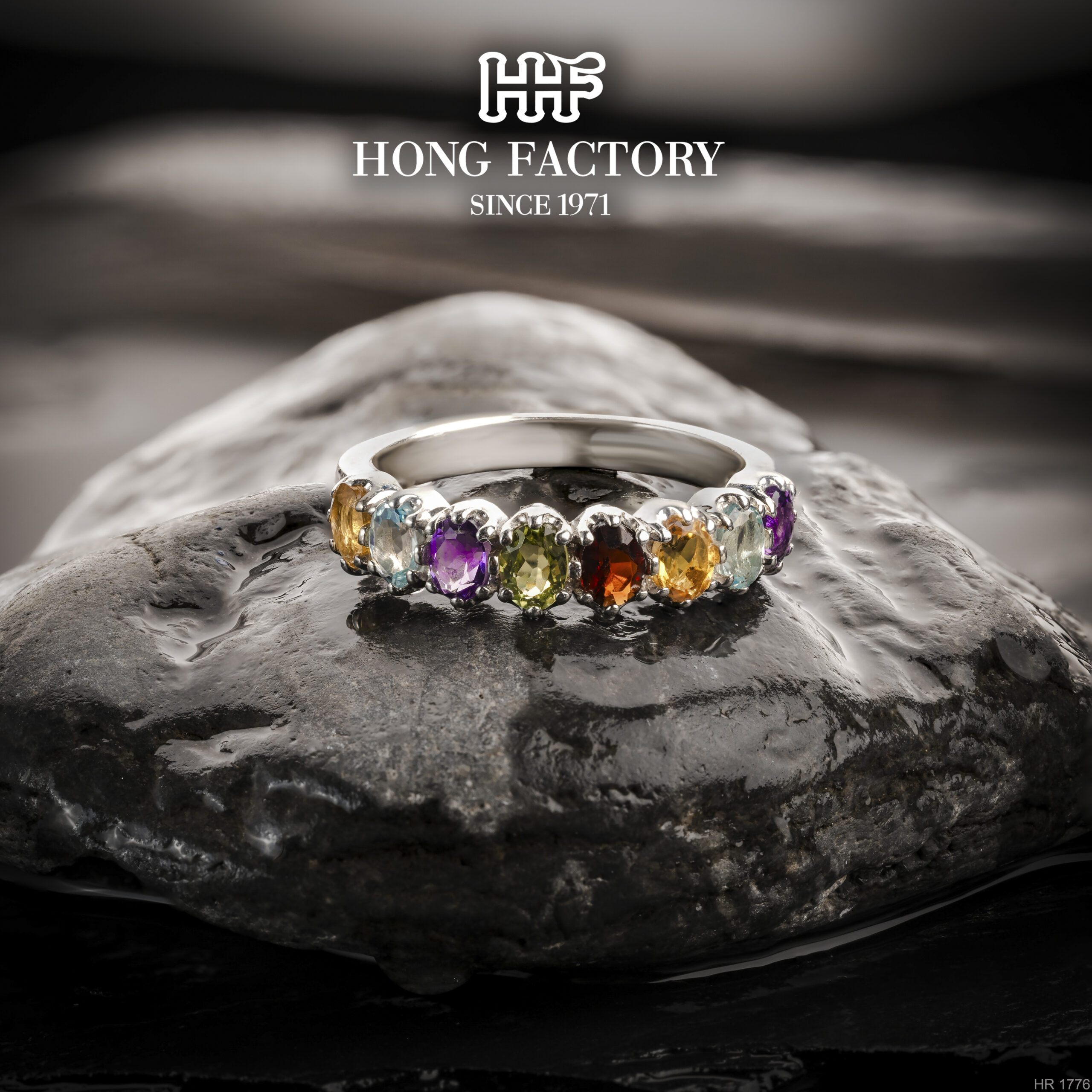
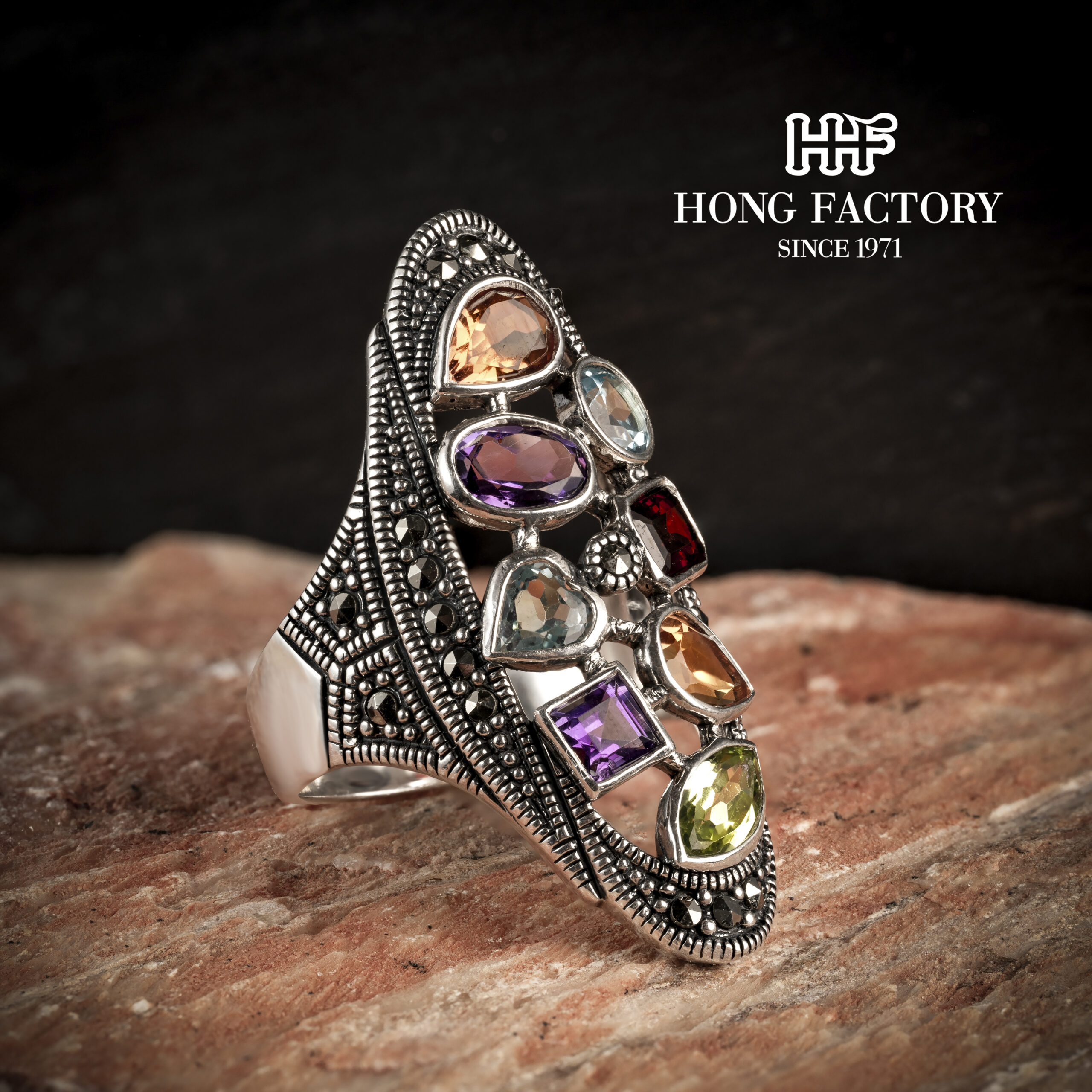
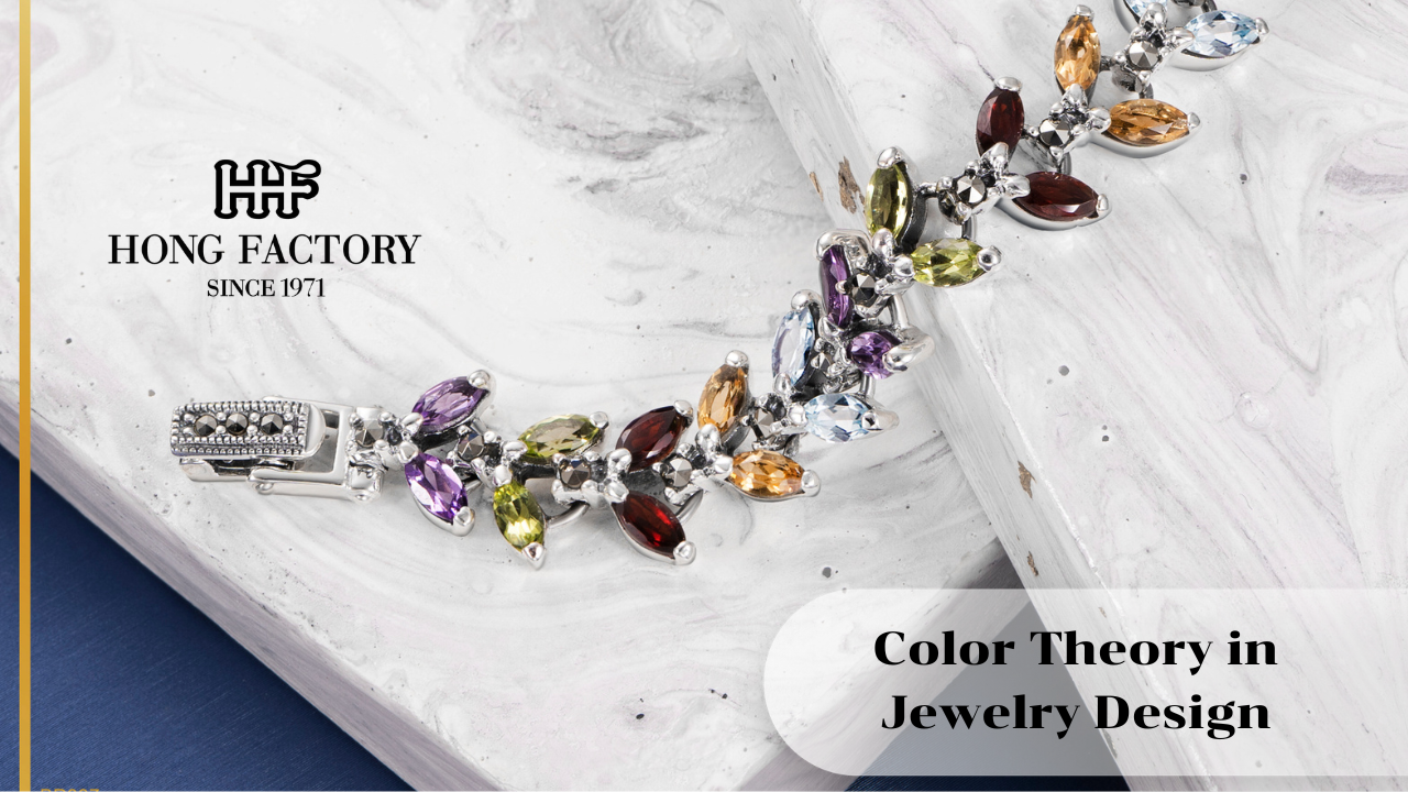
Color plays a vital role in how jewelry is perceived, worn, and valued. Beyond aesthetics, color influences emotion, balance, and consumer decision-making. For silver and marcasite jewelry brands, understanding color theory in jewelry design helps create pieces that feel harmonious, expressive, and commercially successful.
This article explains the fundamentals of color theory as applied to jewelry design, with practical guidance on using color effectively in silver and marcasite collections. sterling silver meaning
Why Color Theory Matters in Jewelry Design

Color communicates before words.
In jewelry, color:
- Creates emotional response
- Defines focal points and hierarchy
- Influences perceived value and wearability
- Affects how jewelry pairs with outfits and skin tones
Well-chosen color combinations elevate design quality and brand professionalism.
Understanding Basic Color Theory
Color theory provides a framework.
The Color Wheel
The traditional color wheel includes:
- Primary colors (red, blue, yellow)
- Secondary colors (green, orange, purple)
- Tertiary colors (combinations of primary and secondary)
Designers use this structure to create balanced and intentional color relationships.
Warm vs Cool Colors
Colors are often grouped as:
- Warm colors: red, orange, yellow
- Cool colors: blue, green, purple
Silver and marcasite naturally lean toward cool tones, influencing stone and accent choices.
The Role of Silver and Marcasite in Color Balance
Silver acts as a neutral base.
Silver as a Color Anchor
Sterling silver:
- Reflects surrounding colors
- Enhances cool and neutral palettes
- Softens strong color contrasts
This makes silver highly adaptable across color schemes.
Marcasite’s Subtle Metallic Tone
Marcasite provides:
- Neutral gray-black sparkle
- Texture without strong color dominance
- A bridge between bright and muted tones
Marcasite supports color harmony rather than competing with it.
Using Monochromatic Color Schemes
Monochromatic designs feel elegant.
How Monochromatic Jewelry Works
These designs use:
- One primary color
- Variations in tone, shade, or saturation
Examples include all-silver designs or silver paired with stones of similar hues.
Benefits
- Clean and timeless appearance
- Easy styling and wearability
- Strong minimalist appeal
Monochromatic schemes are ideal for everyday jewelry.
Complementary Color Combinations in Jewelry
Complementary colors create contrast.
Understanding Complementary Pairs
Colors opposite each other on the color wheel, such as:
- Blue and orange
- Red and green
- Purple and yellow
In jewelry, complementary contrast must be controlled.
Practical Applications
Silver and marcasite designs often use:
- Blue topaz with silver for freshness
- Garnet with marcasite for richness
- Onyx with silver for dramatic contrast
These combinations draw attention while remaining elegant.
Analogous Color Schemes for Soft Harmony
Analogous colors sit next to each other.
Jewelry Applications
Designers may combine:
- Blue, teal, and green stones
- Purple and pink hues
Analogous schemes feel calm and cohesive, ideal for romantic or feminine designs.
Neutral Color Palettes in Jewelry Design
Neutral palettes are timeless.
Common Neutral Elements
- Silver
- Black (onyx, oxidized finishes)
- White (mother of pearl, pearls)
- Gray (marcasite)
Neutral designs suit a wide audience and age range.
Color as a Focal Point in Jewelry
Color guides the eye.
Creating Visual Hierarchy
Designers often:
- Use one dominant color
- Support it with neutral accents
- Avoid multiple competing focal colors
Clear hierarchy prevents visual clutter.
Skin Tone Considerations in Color Selection
Wearability depends on compatibility.
Matching Colors to Skin Tones
- Cool skin tones pair well with silver, blue, purple, and gray
- Warm skin tones suit gold accents, red, and earth tones
Silver jewelry benefits from adding adaptable accent colors.
Color Theory in Statement vs Minimalist Jewelry

Design intent shapes color use.
Minimalist Jewelry
- Limited color palette
- Subtle contrasts
- Emphasis on form and proportion
Statement Jewelry
- Strong color contrast
- Bold focal stones
- Dramatic visual impact
Both rely on controlled color balance.
Using Color to Express Emotion and Meaning
Color conveys symbolism.
Emotional Associations
- Blue: calm and trust
- Red: passion and strength
- Green: growth and balance
- Black: sophistication and mystery
Designers can align color choices with brand storytelling.
Color Trends vs Timeless Color Choices
Balance trend awareness with longevity.
Trendy colors may attract attention but risk short lifespans. Timeless palettes rely on:
- Neutral foundations
- Limited accent colors
- Subtle variation rather than extremes
This approach supports long-term collections.
Color Theory in Jewelry Marketing and Photography
Presentation affects perception.
Marketing Considerations
- Consistent color tones across collections
- Clear contrast in product photography
- Lifestyle images that reinforce color harmony
Color consistency strengthens brand recognition.
Avoiding Common Color Theory Mistakes
Mistakes reduce design effectiveness.
Mistakes to Avoid
- Using too many colors in one piece
- Ignoring metal tone influence
- Choosing colors without emotional or functional intent
Intentional color use is essential.
The Long-Term Value of Color Theory in Jewelry Design
Color mastery builds design confidence.
Understanding color theory enables jewelry brands to create pieces that are not only visually appealing but also emotionally resonant and commercially viable.
Conclusion
Color theory in jewelry design is a powerful tool that guides balance, emotion, and visual impact. For silver and marcasite jewelry brands, mastering color relationships allows designers to enhance elegance, improve wearability, and strengthen brand identity. By using silver as a neutral foundation, applying thoughtful color schemes, and aligning color with purpose, brands can create jewelry collections that remain relevant, expressive, and timeless.
